Statsig A/B Tests
Statsig is the preferred experimentation platform for Beam Impact and is frequently used for A/B testing a Beam integration to show the impact that the Beam experience has in driving positive sales metrics for our partners.
This guide will walk through an implementation of Statsig to enable an A/B test of the Beam experience vs. a Control case (the existing, non-Beam experience).
Beam provides a plugin to use Statsig for A/B testing. To use it, add the plugin to the init() command that was already configured.
Plugin
import { init } from "https://sdk.beamimpact.com/web-sdk/{{ settings.beam_sdk_version }}/dist/integrations/beam.js"
import { StatsigPlugin } from "https://sdk.beamimpact.com/web-sdk/{{ settings.beam_sdk_version }}/dist/integrations/statsig.js"
import { PromoManagerPlugin } from "https://sdk.beamimpact.com/web-sdk/{{ settings.beam_sdk_version }}/dist/integrations/promoManager.js";

const beam = await init({
  apiKey: "abc123", // Beam SDK API Key
  /* ... See Beam Configuration Options ... */
  plugins: [
    new PromoManagerPlugin(),
    new StatsigPlugin({ statsigApiKey: "statsig_client_key_here" })
  ],
});
Setup
Setup for A/B tests is async (it takes a few milliseconds to load).
Waiting for Beam A/B test setup to be ready in other scripts:
import { getConfig } from "https://sdk.beamimpact.com/web-sdk/{{ settings.beam_sdk_version }}/dist/integrations/beam.js"
const beam = getConfig();
await beam.readyPromise; // Resolves when plugins are all ready

// OR use event listeners
if (beam.status !== "ready") {
  beam.addEventListener("beamstatuschange", (event) => {
    const status = event.detail.status;
    if (status === "ready") doSomething(beam);
    else if (status === "error") handleError(event.detail.error);
  });
}
Events
Initializing the Statsig plugin will automatically log statsig_init, cart_created, and order_created events.
To manually log additional events:
beam.plugins.statsig.logEvent(eventName, eventValue, metadataObject);
Visibility
Once initialized, all Beam widgets have display: none unless user is assigned to A/B test group that shows Beam.
To hide additional elements, add the CSS className beam-sync-visibility to them. Elements with this class will automatically have display: none if the user can't see Beam.
Experiment Values
To access the experiment state in JavaScript:
import { getConfig } from "https://sdk.beamimpact.com/web-sdk/{{ settings.beam_sdk_version }}/dist/integrations/beam.js";

getConfig().plugins.statsig.experiments.shouldShowBeam; // boolean
Adding the Beam Parameter to Your Abandonment Links
When sending cart or checkout abandonment emails, include two special parameters in the links that bring customers back to your store. These parameters allow Beam to reconnect the returning shopper to their original session so they stay in the same Statsig experiment variant they were previously assigned to.
The Two Parameters
| Parameter | What it does | Value |
|---|---|---|
beam_return_origin | Identifies which abandonment flow triggered the email | checkout_abandon |
beam_ssid | Links the session back to the customer’s original cart | cart attribute remote_session_id |
Together they look like this:
beam_return_origin=checkout_abandon&beam_ssid=###
Note: Use
checkout_abandonfor checkout abandonment emails
How to Append Parameters to Your Link
How you add these parameters depends on what your link already looks like:
Case 1: No existing parameters
Example:
https://example.com/cart
Add ? followed by the Beam parameters:
Result:
https://example.com/cart?beam_return_origin=checkout_abandon&beam_ssid=12345
Case 2: Existing parameters
Example:
https://example.com/cart?utm_source=email
Add & followed by the Beam parameters:
Result:
https://example.com/cart?utm_source=email&beam_return_origin=checkout_abandon&beam_ssid=12345
Case 3: URL contains a #
Example:
https://example.com/cart#items
Insert parameters before the #:
Result:
https://example.com/cart?beam_return_origin=checkout_abandon&beam_ssid=12345#items
If both parameters and a # exist:
Example:
https://example.com/cart?utm_source=email#items
Result:
https://example.com/cart?utm_source=email&beam_return_origin=checkout_abandon&beam_ssid=12345#items
Quick Reference
| Your link looks like… | What to add | Example result |
|---|---|---|
https://example.com/cart | ? + parameters | ...?beam_return_origin=checkout_abandon&beam_ssid=12345 |
https://example.com/cart?foo=bar | & + parameters | ...?foo=bar&beam_return_origin=checkout_abandon&beam_ssid=12345 |
https://example.com/cart#items | ? before # | ...?beam_return_origin=checkout_abandon&beam_ssid=12345#items |
Not sure which case applies? Paste your link and reach out to your Beam Client Strategy Lead.
Klaviyo Cart Abandonment: Statsig Tracking Links
For cart abandonment emails in Klaviyo, use the following template block to add a "Return to Cart" button. The code
checks whether the customer was assigned to the Statsig treatment group (i.e., they saw the Beam widget during
checkout). If so, the button URL includes beam_ssid and beam_return_origin=checkout_abandon so Statsig can attribute
the conversion back to the correct experiment session. Customers in the control group receive a plain checkout link with
no tracking parameters. Note that the "Checkout Started" Shopify trigger must be used for the Klaviyo trigger to access the necessary cart metadata.
Follow these steps to add the enhanced button:
Step 1: Switch to the HTML editor in your Klaviyo template
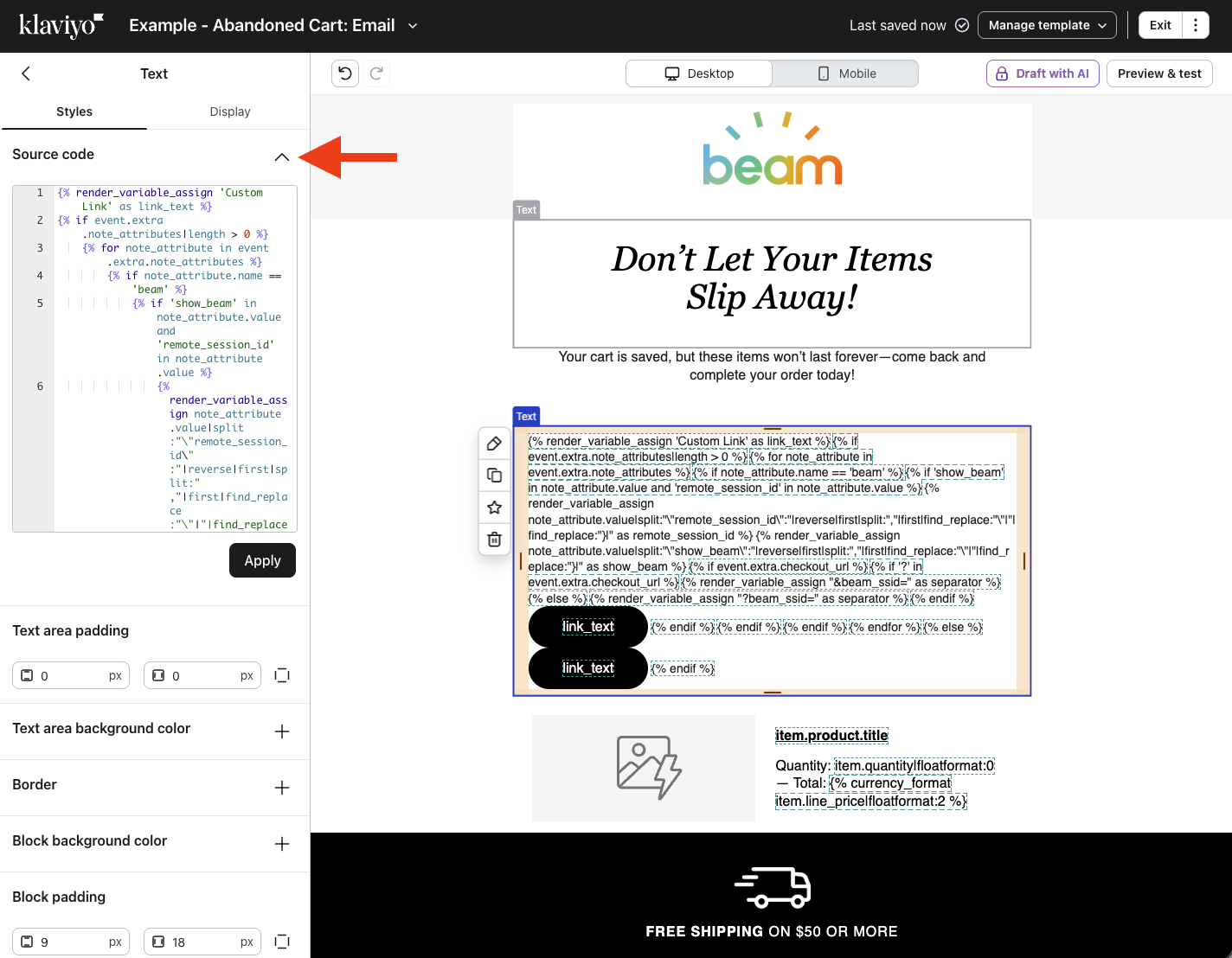
Step 2: Insert the button
Paste the following where you want the button to appear:
<!-- Replace 'Custom Link' with desired checkout button text -->
{% render_variable_assign 'Custom Link' as link_text %}
{% with beam_attrs=event.extra.note_attributes|dictfilter:"name==beam" %}
  {% if beam_attrs %}
    {% for note_attribute in event.extra.note_attributes %}
        {% if note_attribute.name == 'beam' %}
            {% if 'show_beam' in note_attribute.value and 'remote_session_id' in note_attribute.value %}
                {% render_variable_assign note_attribute.value|split:"\"remote_session_id\":"|reverse|first|split:","|first|find_replace:"\"|"|find_replace:"}|" as remote_session_id %}
                {% render_variable_assign note_attribute.value|split:"\"show_beam\":"|reverse|first|split:","|first|find_replace:"\"|"|find_replace:"}|" as show_beam %}
                {% if event.extra.checkout_url %}
                    {% if '?' in event.extra.checkout_url %}
                        {% render_variable_assign "&beam_ssid=" as separator %}
                    {% else %}
                        {% render_variable_assign "?beam_ssid=" as separator %}
                    {% endif %}
                    <!-- Statsig session exists on cart - URL params added to checkout link -->
                    <a href="{{ event.extra.checkout_url }}{{separator}}{{remote_session_id}}&beam_return_origin=checkout_abandon&show_beam={{show_beam}}" style="color: #fff; text-decoration: none; display: inline-block; background: #000; font-family: Helvetica, Arial; font-size: 16px; font-style: normal; font-weight: 400; line-height: 100%; letter-spacing: 0; margin: 0; text-transform: none; padding: 16px 40px; border-radius: 50px;">{{ link_text }}</a>
                {% endif %}
            {% else %}
                <!-- Fallback, Beam attribute on cart but no Statsig - default checkout link -->
                <a href="{{ event.extra.checkout_url }}" style="color: #fff; text-decoration: none; display: inline-block; background: #000; font-family: Helvetica, Arial; font-size: 16px; font-style: normal; font-weight: 400; line-height: 100%; letter-spacing: 0; margin: 0; text-transform: none; padding: 16px 40px; border-radius: 50px;">{{ link_text }}</a>
            {% endif %}
        {% endif %}
    {% endfor %}
  {% else %}
    <!-- Fallback, no Beam attribute on cart - default checkout link -->
    <a href="{{ event.extra.checkout_url }}" style="color: #fff; text-decoration: none; display: inline-block; background: #000; font-family: Helvetica, Arial; font-size: 16px; font-style: normal; font-weight: 400; line-height: 100%; letter-spacing: 0; margin: 0; text-transform: none; padding: 16px 40px; border-radius: 50px;">{{ link_text }}</a>
  {% endif %}
{% endwith %}
Step 3: Preview the button
Open the Preview panel and select an event that includes the beam note attribute with show_beam and remote_session_id Statsig properties. This ensures the tracking link button renders correctly. Events without the beam note attribute or which were not assigned to a Statsig treatment group will display the plain checkout link instead.
Step 4: Customize the button
To change the button label, update the text in the first line:
{% render_variable_assign 'Custom Link' as link_text %}
Replace Custom Link with your desired label (e.g., Return to Cart), keeping the single quotes.
Button styling
There are three <a> tags in the template (one for each conditional branch). Update the style attribute on all three
to keep the button consistent across all recipients.
The button's appearance is controlled by the style attribute on each <a> tag. The defaults are:
| Property | Default value | What it controls |
|---|---|---|
background | #000 | Button background color |
color | #fff | Text color |
font-size | 16px | Text size |
font-weight | 400 | Text weight |
padding | 16px 40px | Space inside the button (vertical / horizontal) |
border-radius | 50px | Rounded corners |
font-family | Helvetica, Arial | Font stack |
Shopify Email Marketing: Statsig Tracking Links
For checkout abandonment emails sent through Shopify's email marketing, use the following Liquid template block to add a "Return to Checkout" button. The code reads the beam cart attribute to determine whether the customer was in the Statsig treatment group (i.e., they saw the Beam widget during checkout). If so, the button URL is built with beam_ssid and beam_return_origin=checkout_abandon so Statsig can attribute the conversion back to the correct experiment session. Otherwise, href defaults to the plain url value, so all recipients get a working button.
Follow these steps to add the enhanced button:
Step 1: Open the email template editor in Shopify
Navigate to Marketing → Automations (or your abandoned checkout email flow) and open the email template for editing. Switch to the HTML/code view. If using Shopify's Notification settings, navigate to Settings → Checkout → Abandoned checkout emails → Customize email.
Step 2: Insert the button
Paste the following code snippet where you want the button to appear:
{% assign link_text = 'Custom Link' %}
{% assign href = url %}
{% assign beam = attributes.beam %}

{% if beam.remote_session_id %}
  {% assign show_beam = beam.show_beam %}
  {% assign separator = '?beam_ssid=' %}
  {% if url contains '?' %}{% assign separator = '&beam_ssid=' %}{% endif %}
  {% assign href = url | append: separator | append: beam.remote_session_id | append: '&beam_return_origin=checkout_abandon&show_beam=' | append: show_beam %}
{% endif %}

{% if url %}
  <a href="{{ href }}" style="color: #fff; text-decoration: none; display: inline-block; background: #000; font-family: Helvetica, Arial; font-size: 16px; font-style: normal; font-weight: 400; line-height: 100%; letter-spacing: 0; margin: 0; text-transform: none; padding: 16px 40px; border-radius: 50px;">{{ link_text }}</a>
{% endif %}
Step 3: Preview the button
Use Shopify's Preview feature to verify the button's appearance. Note that Shopify's preview does not render with real event data, so the Beam tracking parameters will not be testable in preview.
Step 4: Customize the button
To change the button label, update the text in the first line:
{% assign link_text = 'Custom Link' %}
Replace Custom Link with your desired label (e.g., Return to Cart), keeping the single quotes.
The template uses a single <a> tag. Update its style attribute to customize the button appearance.