iOS SDK
Requirements
- Minimum operating system requirement is iOS 13
- Written in SwiftUI but can be used with UIKit
How to Integrate
Swift Package Manager
- The url is: https://github.com/Beam-Impact/BeamKit use up to next major version 1.0.0
- If you have a Package.swift file and want to add BeamKit as a dependency through that you may
dependencies: [
    .package(url: "https://github.com/Beam-Impact/BeamKit", .upToNextMajor(from: "1.0.0"))
]
Carthage
- Add BeamKit to your Cartfile
github "Beam-Impact/BeamKit" ~> 1.0.0
- run
carthage update —use-xcframeworks - Add
BeamKit.xcframeworkto Frameworks, Libraries, and Embedded Content in your target
Import BeamKit
In any file that needs BeamKit, include import BeamKit at top.
Setup
Initialization
The main way that you interact with the BeamKit SDK is through the BKManager. Add BKManager as a var in the AppDelegate or SceneDelegate class then initialize the BKManager in your AppDelegate. This is necessary to set up the SDK as soon as possible. The apiKey & chainId can be acquired from your companies POC for the Beam integration.
BKManager(apiKey: String,  // Unique key used for authorization
				  chainId: Int,  // Unique identifier to your company
				  environment: BKAppEnvironment,  // Indicates which endpoint to hit
				  logLevel: BKLogLevel,  // What level of logging is preferred
				  fontRegular: FontInfo?,  // Custom font struct for regular weight
				  fontSemiBold: FontInfo?,  // Custom font struct for semi-bold weight
				  fontBold: FontInfo?,  // Custom font struct for bold weight
				  progressBarConfig: BKProgressBarConfiguration,  // Configuration for progress bar shown on widgets (defaults to standard)
				  schemaVersion: String,  // The version number for any copy that has been customized using our remote config service (if none then pass in 1.0)
				  placeholderImage: String? = nil)  // The name of the asset desired to be a placeholder image which will be shown while a remote image is being fetched asynchronously
class AppDelegate: NSObject, UIApplicationDelegate, ObservableObject {
	var bkManager: BKManager?

	override init() {
		self.bkManager = BKManager(apiKey: "publicKey.privateKey",
												  chainId: 1,
												  environment: .production,
													logLevel: .debug,
												  fontRegular: FontInfo(fontFileName: "Regular-Font",
																								bundle: .main,
																								fileExtension: ".otf",
																								fontFamilyName: "Regular-Font-Name"),
													fontSemiBold: FontInfo(fontFileName: "SemiBold-Font",
																								 bundle: .main,
																								 fileExtension: ".otf",
																								 fontFamilyName: "SemiBold-Font-Name"),
													fontBold: FontInfo(fontFileName: "Bold-Font",
																						 bundle: .main,
																						 fileExtension: ".otf",
																						 fontFamilyName: "Bold-Font-Name"),
												  progressBarConfig: BKProgressBarConfiguration(height: 5.0,
																																				borderConfig: BKBorderConfiguration(width: 0, color: .black, cornerRadius: 45),
																																				gradient: [.red, .yellow, .orange],
																																				backgroundColor: .gray),
													schemaVersion: "1.0",
								 					placeholderImage: "Placeholder.png")
	}
}
Customization
Fonts
BeamKit gives you the ability to add a custom font for three different weights which are used throughout the SDK: regular, semi-bold, & bold.
- Add the font file to the project somewhere in the filesystem
- Create an instance of the class FontInfo for each weight
- Pass the FontInfo instance into the BKManager init corresponding to the desired weight
FontInfo(fontFileName: String,  // The exact name for the file containing the font excluding the extension
				 bundle: Bundle,  // This should be .main
				 fileExtension: String,  // Either ".otf" or ".ttf"
				 fontFamilyName: String? = nil)  // This often differs from the file name

let regularFont = FontInfo(fontFileName: "Regular-Font",
													 bundle: .main,
													 fileExtension: ".otf",
													 fontFamilyName: "Regular-Font-Name")
To get the family name, which isn’t always obvious and often is different than the file name you can add the following bit of code somewhere in your app and XCode will print all of the available family names in the terminal. (See the section in Apple’s documentation named Use Your Custom Font in Source Code)
for family in UIFont.familyNames.sorted() {
    let names = UIFont.fontNames(forFamilyName: family)
    print("Family: \(family) Font names: \(names)")
}
Progress Bar
The progress bar can be fully customized using the BKProgressBarConfiguration which is passed into the BKManager on init.
BKProgressBarConfiguration(height: CGFloat,
													 borderConfig: BKBorderConfiguration,
													 gradient: [Color]?,
													 backgroundColor: Color?)

let progressBarConfig = BKProgressBarConfiguration(height: 5.0,
																									 borderConfig: BKBorderConfiguration(width: 0, color: .black, cornerRadius: 45),
																									 gradient: [.red, .yellow, .orange],
																									 backgroundColor: .gray)
Text
You can customize each section of text within the views and this is done with a BKTextConfiguration which is then passed into each views corresponding configuration struct. Allowing you to configure the color, size, and weight. As previously mentioned, the only weights supported are regular, semi-bold, and bold.
public struct BKTextConfiguration {
	var color: Color  // default: .black
	var size: CGFloat  // default: 12
	var weight: Font.Weight  // default: .regular
}
let textConfig = BKTextConfiguration(color: Color(gray: 0.5, opacity: 0.7),
																		 size: 12.0,
																		 weight: .regular)
Images
Image customization is done by creating a BKImageConfiguration and passing it into a views corresponding configuration struct. For the shape, it can be either square or circle.
public struct BKImageConfiguration {
	var cornerRadius: CGFloat  // default: 0
	var shape: BKImageShape  // default: .circle
	var size: CGSize  // default: CGSize(width: 50.0, height: 50.0)
}

public enum BKImageShape {
	case circle
	case square
}
let imageConfig = BKImageConfiguration(cornerRadius: 20,
																			 shape: .square,
																			 size: CGSize(width: 100, height: 100))
Borders
Border customization is done by creating a BKBorderConfiguration and passing it into a views corresponding configuration struct.
public struct BKBorderConfiguration {
	var width: CGFloat  // default: 2
	var color: Color  // default: .black
	var cornerRadius: CGFloat  // default: 10
}
let borderConfig = BKBorderConfiguration(width: 5,
																				 color: Color(gray: 0.6, opacity: 0.4),
																				 cornerRadius: 20)
Buttons
Button customization is done by creating a BKButtonConfiguration and passing it into a views corresponding configuration struct.
public struct BKButtonConfiguration {
	var unselectedColor: Color  // Color of the button when unselected default: Color(gray: 0.8)
	var selectedColor: Color  // Color of the button when selected default: .black
	var borderConfig: BKBorderConfiguration  // Border configuration
	var textConfig: BKTextConfiguration  // Text configuration
	var size: CGSize  // Height & width of the button default: CGSize(width: 100.0, height: 50.0)
}
let buttonConfig = BKButtonConfiguration(unselectedColor: .green,
                                         selectedColor: .blue,
																			   borderConfig: BKBorderConfiguration(color: .clear),
																			   textConfig: BKTextConfiguration(color: .white,
																																			   size: 16.0,
																																			   weight: .bold),
                                         size: CGSize(width: 100.0, height: 100.0))
Icons
Border customization is done by creating a BKIconConfiguration and passing it into a views corresponding configuration struct.
public struct BKIconConfiguration {
	var size: CGSize  // default: CGSize(width: 20.0, height: 20.0)
	var unselectedColor: Color  // default: .black
	var selectedColor: Color  // default: .white
}
let iconConfig = BKIconConfiguration(size: CGSize(width: 60.0, height: 60.0),
																		 unselectedColor: .red,
																		 selectedColor: .green)
Logo Header
A few of the widgets have the company and Beam’s logo at the top which is customizable by creating a BKLogoHeaderConfiguration and passing it into a views corresponding configuration struct.
public struct BKLogoHeaderConfiguration {
	/// The configurable width for the company's logo
	///
	/// Since the contentMode is set to .fit only one dimension
	/// is necessary to configure logo to the desired look.
	/// the height will adjust so that the aspect ratio is maintained.
	var chainLogoWidth: CGFloat

	/// The configurable width for the Beam logo
	///
	/// Recommended not to change this width but to adjust the chainLogoWidth
	/// to a size that looks proprotionate to the Beam logo.
	var beamLogoWidth: CGFloat

	/// The amount of padding added to the bottom of the company logo
	///
	/// Adjust this as required to get the logo centered
	var chainLogoBottomPadding: CGFloat

	/// The amount of padding added to the bottom of the Beam logo
	///
	/// Adjust this as required to get the logo centered
	var beamLogoBottomPadding: CGFloat

	var backgroundColor: Color
}
let logoConfig = BKLogoHeaderConfiguration(chainLogoWidth: 75.0,
																					 beamLogoWidth: 75.0,
																					 chainLogoBottomPadding: 0.0,
																					 beamLogoBottomPadding: 0.0,
																					 backgroundColor: .white)
Interface
Using BKManager
There are several different ways to access an AppDelegate from within an app. Once you do you can access the bkManager property and make function calls.
This is an example using SwiftUI
struct ContentView: View {
	@EnvironmentObject private var appDelegate: AppDelegate

	var body: some View {
		// content
	}
	.onAppear {
		if let bkManager = appDelegate.bkManager {
			// method calls
		}
	}
}
Registering a User
At some point a user email has to be submitted in order to make a transaction valid, it’s easiest if this is just done after initialization through the registerUser call on the BKManager if the user is logged in. If a user isn’t logged in then an email can be passed in during the transaction phase, this would be expected when the user is performing a transaction as a guest.
/// Registers a user for a given email address
/// - Parameters:
/// 	- email: Users email address
/// 	- completion: Optional completion handler that returns true
///                 if successful & false if not
public func registerUser(email: String, _ completion: ((Bool) -> Void)? = nil)
bkManager.registerUser(email: "AAA@test.com") { success in
	// completion code
}
Deregistering a User
This will clear the current active user so that all of the impact views are blank. It is essentially a “logout” function.
/// Clears all information about the current user from the app state
///
///  - Parameters:
/// 	- completion: Optional completion handler that returns true
///                 if successful & false if not
public func deregisterUser(_ completion: ((Bool) -> Void)? = nil)
bkManager.deregisterUser() { success in
	// completion code
}
Transactions
The transaction methods are how donations are sent to nonprofits through Beam. All transactions must have information corresponding to the BKTransaction model.
public struct BKTransaction {
	let cartTotal: Float  // The cart total
	let currencyCode: String  // The currency code
	let storeId: Int  // The store id
	let email: String?  // The email of the user, defaults to nil
	let postalCode: String?  // Users postal code, defaults to nil
	let countryCode: String?  // Users country code, defaults to nil
}
To start a transaction you must call startTransaction(transaction:completion) on BKManager with the required data for a BKTransaction. Then once the purchase is complete and you have an order number you call finishTransaction(orderId:email) . An orderId is required but an email is optional. Passing in an email here would be used for the case where this is a guest shopper, isn’t logged in, and registerUser(email) wasn’t called.
let transaction = BKTransaction(cartTotal: 20.0,
																currencyCode: "USD",
																storeId: 1,
																email: "aaa@test.com",
																postalCode: "97123",
																countryCode: "US")
bkManager.startTransaction(transaction) { success in
	// completion code
}

bkManager.finishTransaction(orderId: "9991", email: "aaa@test.com") { success in
	// completion code
}
Start Transaction
Should be called once you have all of the info needed to create a BKTransaction.
/// Stores a current transaction which will be used when finishTransaction
/// is called
///
/// - Parameters:
/// 	- transaction: A BKTransaction with relevant transaction information
/// 	- completion: Optional completion handler that returns true if successful
///                 & false if not
public func startTransaction(_ transaction: BKTransaction,
														 _ completion: ((Bool) -> Void)? = nil)
let transaction = BKTransaction(cartTotal: 20.0,
																currencyCode: "USD",
																storeId: 1,
																email: "aaa@test.com",
																postalCode: "97123",
																countryCode: "US")

bkManager.startTransaction(transaction) { success in
	// completion code
}
Finishing a Transaction
Once the purchase is complete and you have an order number you call finishTransaction(orderId:email) . An orderId is required but an email is optional. Passing in an email here would be used for the case where this is a guest shopper, isn’t logged in, and registerUser(email) wasn’t called.
/// Completes the stored transaction with the stored nonprofit id.
/// startTransaction must be called prior to this method
///
/// - Parameters:
/// 	- orderId: A unique order ID that is associated with this transaction
/// 	- email: Optionally, provide an email address if there is not one
///            associated with the registered user
/// 	- completion: Optional completion handler that returns true
///                 if successful & false if not
public func finishTransaction(orderId: String,
															email: String? = nil,
															_ completion: ((Bool) -> Void)? = nil)
bkManager.finishTransaction(orderId: "ABCD1", email: "aaa@test.com") { success in
	// completion code
}
Canceling a Transaction
Transaction can be cancelled after they are created by passing in the unique orderId you provided during finishTransaction.
/// Cancels the transaction for the provided order ID
///
/// - Parameters:
/// 	- orderId: A unique order ID that is associated with this transaction
/// 	- completion: Optional completion handler that returns true
///                 if successful & false if not
public func cancelTransaction(orderId: String,
															_ completion: ((Bool) -> Void)? = nil)
bkManager.cancelTransaction(orderId: "ABCD1", email: "aaa@test.com") { success in
	// completion code
}
Redeeming a Transaction
A transaction can also be updated with the selected nonprofit. This is useful if a user never selected a nonprofit before the transaction was created.
/// Updates an existing transaction with the stored nonprofit ID.
/// Should be called if the user adds or changes their nonprofit selection
///
/// - Parameters:
/// 	- transaction: A BKTransaction with relevant transaction information
/// 	- orderId: A unique order ID that is associated with this transaction
/// 	- completion: Optional completion handler that returns true
///                 if successful & false if not
public func redeemTransaction(transaction: BKTransaction,
															orderId: String,
															_ completion: ((Bool) -> Void)? = nil)
let transaction = BKTransaction(cartTotal: 20.0,
																currencyCode: "USD",
																storeId: 1,
																email: "aaa@test.com",
																postalCode: "97123",
																countryCode: "US")

bkManager.redeemTransaction(transaction: transaction, orderId: "ABCD1") { success in
	// completion code
}
Error States
At some point during the creation of a transaction, an email must be provided. This can be done via registerUser, startTransaction, or finishTransaction. Note that an error will occur for the following scenarios:
- A transaction was started with a different email than the one belonging to the registered user.
- A transaction was finished without being started.
- A transaction was finished without a registered user and without providing an email when starting or finishing the transaction.
- A transaction was started with a different email than the one used to finish it.
- A transaction was finished with a different email than the one belonging to the registered user.
Getting Selected Nonprofit
At any point after a user has selected a nonprofit, you can get the name and cause of the selected nonprofit if you choose to display it somewhere.
/// Returns the user's currently selected nonprofit and cause, if it exists
public func getSelectedNonprofit() -> (nonprofitName: String?, nonprofitCause: String?)
let nonprofitInfo = bkManager.getSelectedNonprofit()
print(nonprofitInfo.nonprofitName)
print(nonprofitInfo.nonprofitCause)
Widgets
- BKMinimalNonprofitSelectionView
- BKFullScreenNonprofitSelectionView
- BKImpactListView
- BKSelectedNonprofitView
- BKPersonalImpactView
- BKCommunityImpactView
- BKOrderPageView
BKMinimalNonprofitSelectionView
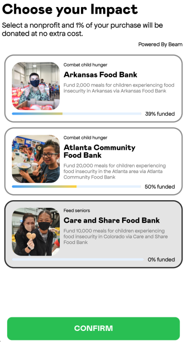
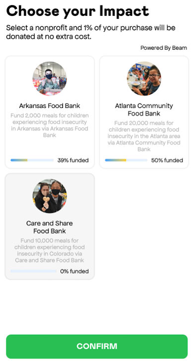
A compact way to allow a user to select a nonprofit; can go in cart or on an order confirmation page (if the user hasn’t selected a nonprofit yet). The isPrepurchase boolean is used to determine if the view is used anytime during the pre-purchase flow or not. For pre-purchase there is no confirm button, post-purchase the confirm button is active.
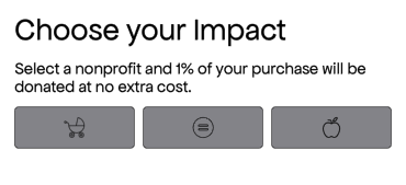
no confirm button pre selection
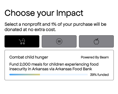
no confirm button post selection
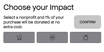
confirm button pre selection
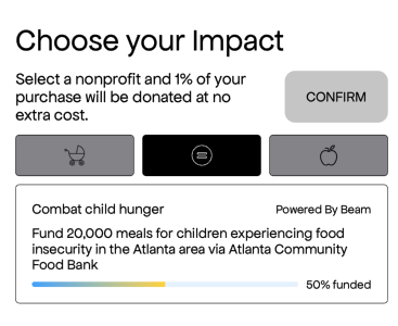
confirm button post selection
-
Toggle for details on Usage, Customization, & Delegate
Usage
SwiftUI
BKMinimalNonprofitSelectionView(config: BKMinimalNonprofitViewConfiguration(),
																delegate: delegate,
																isPrePurchase: true)
UIKit
let bkView = BKMinimalNonprofitSelectionView(config: BKMinimalNonprofitViewConfiguration(),
																						 delegate: delegate,
																						 isPrePurchase: true)
let childView = UIHostingController(rootView: bkView)
addChild(childView)
childView.view.frame = view.frame
view.addSubview(childView.view)
childView.didMove(toParent: self)
Customization
You can customize almost all of the aspects of the view using BKMinimalNonprofitViewConfiguration which gets passed in on init.
public struct BKMinimalNonprofitViewConfiguration {
	var widgetTitleConfig: BKTextConfiguration  // "Choose your Impact"
	var widgetSubtitleConfig: BKTextConfiguration  // "Select a nonprofit.."
	var confirmButtonConfig: BKButtonConfiguration  // Customize the CONFIRM button
	var iconConfig: BKIconConfiguration  // Cause icons
	var causeButtonConfig: BKButtonConfiguration  // Cause button
	var causeTitleConfig: BKTextConfiguration  // "Combat child hunger"
	var causeDescriptionConfig: BKTextConfiguration  // "Fund 2,000 meals.."
	var beamTextConfig: BKTextConfiguration  // "Powered By Beam"

	/// The vertical padding between each of the major elements
	var verticalPadding: CGFloat

	/// BG Color for the entire view
	var backgroundColor: Color
Delegate
The protocol you must conform to in order to receive a callback is BKNonprofitSelectionDelegate which gets passed in during init.
public protocol BKNonprofitSelectionViewDelegate: AnyObject {
	/// Method which is called after user taps the confirm button returning
  /// the name of the nonprofit and the cause
	///
	/// - Parameters:
	///     - nonprofitName: The name of the nonprofit selected
	///     - nonprofitCause: The cause which that nonprofit supports
	func onConfirmTap(nonprofitName: String, nonprofitCause: String)
}
BKFullScreenNonprofitSelectionView
This is another option for allowing a user to select a nonprofit but is meant to take up the whole screen. The isPrepurchase boolean is used to determine if the view is used anytime during the pre-purchase flow or not.
.list style
.grid style
-
Toggle for details on Usage, Customization, & Delegate
Usage
SwiftUI
BKFullScreenNonprofitSelectionView(config: BKFullScreenNonprofitViewConfiguration(),
																	 delegate: delegate,
																   isPrePurchase: true)
UIKit
let bkView = BKFullScreenNonprofitSelectionView(config: BKFullScreenNonprofitViewConfiguration(),
																							  delegate: delegate,
																						    isPrePurchase: true)
let childView = UIHostingController(rootView: bkView)
addChild(childView)
childView.view.frame = view.frame
view.addSubview(childView.view)
childView.didMove(toParent: self)
Customization
You can customize almost all of the aspects of the view using BKFullScreenViewConfiguration which gets passed in on init.
public struct BKFullScreenNonprofitViewConfiguration {
	var widgetTitleConfig: BKTextConfiguration  // "Choose your Impact"
	var widgetSubtitleConfig: BKTextConfiguration  // "Select a nonprofit and.."
	var imageConfig: BKImageConfiguration  // The image on the left of nonprofit tile
	var causeConfig: BKTextConfiguration  // "Combat child hunger, Feed Seniors"
	var nonprofitConfig: BKTextConfiguration  // "Arkansas Food Bank, etc.."
	var impactDescriptionConfig: BKTextConfiguration  // "Fund <n> meals.."
	var confirmButtonConfig: BKButtonConfiguration  // Confirm button at bottom (width not honored)
  var confirmButtonHorizontalPadding: CGFloat  // Determines width of confirm button
	var unselectedBorderConfig: BKBorderConfiguration  // Border for unselected tiles
	var selectedBorderConfig: BKBorderConfiguration  // Border for selected tiles
	var unselectedBackgroundColor: Color  // Bg color for unselected tiles
	var selectedBackgroundColor: Color  // Bg color for selected tiles
	var beamTextConfig: BKTextConfiguration  // "Powered by Beam"
	var headerHeight: CGFloat  // Height of the header if there is oneb

	/// Set whether or not the header should ignore safe area
	var headerIgnoresSafeArea: Bool

	/// Alignment for the title and subtitle
	var textAlignment: Alignment

	/// Items can appear in a list or grid
	var style: BKSelectionViewStyle

	/// The vertical padding between each of the major elements
	var verticalPadding: CGFloat

	/// BG Color for the entire view
	var backgroundColor: Color
Delegate
The protocol you must conform to in order to receive a callback is BKNonprofitSelectionDelegate which gets passed in during init.
public protocol BKNonprofitSelectionViewDelegate: AnyObject {
	/// Method which is called after user taps the confirm button returning the name of the nonprofit and the cause
	///
	/// - Parameters:
	///     - nonprofitName: The name of the nonprofit selected
	///     - nonprofitCause: The cause which that nonprofit supports
	func onConfirmTap(nonprofitName: String, nonprofitCause: String)
}
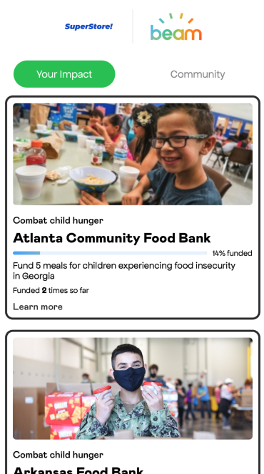
BKImpactListView
This widget is a tabbed view which shows both a summary of users personal impact as well as the impact the community has made. It is scrollable vertically and is meant to take up a whole screen. If there is no personal impact made yet, only community is shown.
-
Toggle for details on Usage, Customization, & Delegate
Usage
SwiftUI
BKImpactListView(config: BKMinimalNonprofitViewConfiguration(),
								 delegate: delegate)
UIKit
let bkView = BKImpactListView(config: BKMinimalNonprofitViewConfiguration(),
														  delegate: delegate)
let childView = UIHostingController(rootView: bkView)
addChild(childView)
childView.view.frame = view.frame
view.addSubview(childView.view)
childView.didMove(toParent: self)
Customization
public struct BKImpactListConfiguration {
var selectedTabTitleConfig: BKTextConfiguration
var unselectedTabTitleConfig: BKTextConfiguration
var tabHeight: CGFloat
var selectedTabBackgroundColor: Color
var unselectedTabBackgroundColor: Color
var imageConfig: BKImageConfiguration // Nonprofit card image
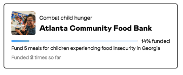
var causeTitleConfig: BKTextConfiguration // "Combat child hunger
var nonprofitTitleConfig: BKTextConfiguration // "Atlanta Community Food.."
var progressBarTextConfig: BKTextConfiguration // "14% funded"
var causeDescriptionConfig: BKTextConfiguration // "Fund <n> meals.."
var goalCompletionTextConfig: BKTextConfiguration // "Funded <n> times.."
var websiteLinkTextConfig: BKTextConfiguration // "Learn more"
/// Configure elements of the brands logo in the header section
var logoHeaderConfig: BKLogoHeaderConfiguration
/// This is the config for the border surrounding each tile
var tileBorderConfig: BKBorderConfiguration
/// The vertical padding between each of the major elements
var verticalPadding: CGFloat
/// BG Color for the entire view
var backgroundColor: ColorDelegate
The protocol to conform to is BKImpactListViewDelegate
public protocol BKImpactListViewDelegate: AnyObject {
	/// Delegate method which is called after the user taps the link to
  /// visit a nonprofit's website
	///
	/// - Parameters:
	///     - website: The nonproift's website url in the form of a String
	func onWebsiteLinkTap(website: String)
}
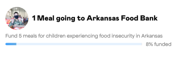
BKSelectedNonprofitView
A compact way to show the user their currently selected nonprofit. Great way to remind the user who their donation is going to in their cart. Two styles to choose from with the option to allow the user to change who they have selected.
regular style

.outToLunch style with square image, divider, & change button
-
Toggle for details on Usage, Customization, & Delegate
Usage
SwiftUI
BKSelectedNonprofitView(config: BKSelectedNonprofitViewConfiguration(),
											  delegate: delegate)
UIKit
let bkView = BKSelectedNonprofitView(config: BKSelectedNonprofitViewConfiguration(),
																	   delegate: delegate)
let childView = UIHostingController(rootView: bkView)
addChild(childView)
childView.view.frame = view.frame
view.addSubview(childView.view)
childView.didMove(toParent: self)
Customization
This view has two configurable styles
.regular&.outToLunch. You can also configure whether or not to show a change button which gets a callback you can use to show one of our selection views to allow the user the ability to change their selected nonprofit. All this and more is done via the BKSelectedNonprofitViewConfiguration struct.public struct BKSelectedNonprofitViewConfiguration {
var impactDescriptionTextConfig: BKTextConfiguration // "1 meal going.."
var goalDescriptionTextConfig: BKTextConfiguration // "Fund 5 meals.."
var progressStringTextConfig: BKTextConfiguration // "8% funded"
var changeButtonTextConfig: BKTextConfiguration
/// This will set the vertical padding between all different element
var verticalPadding: CGFloat
var imageConfig: BKImageConfiguration
var showChangeButton: Bool
/// The config for widgets border
var widgetBorderConfig: BKBorderConfiguration
/// BG Color for the entire view
var backgroundColor: Color
var style: Style
/// outToLunch configs, only available for that style
var shouldShowDivider: Bool
var dividerColor: Color
var dividerHeight: CGFloatDelegate
The protocol which to conform is BKSelectedNonprofitViewDelegate.
public protocol BKSelectedNonprofitViewDelegate: AnyObject {
	/// This method is called on the delegate when the user taps to change
  /// their selected nonprofit
	func onChangeTap()
}
BKPersonalImpactView
A simple, compact way to show the user their impact. This will always show the last impacted nonprofit, not the currently selected nonprofit, if those should differ. If there is no impact to be shown, this view will be empty.
-
Toggle for details on Usage, Customization, & Delegate
Usage
SwiftUI
BKPersonalImpactView(config: BKPersonalImpactViewConfiguration(),
										 delegate: delegate)
UIKit
let bkView = BKPersonalImpactView(config: BKPersonalImpactViewConfiguration(),
																  delegate: delegate)
let childView = UIHostingController(rootView: bkView)
addChild(childView)
childView.view.frame = view.frame
view.addSubview(childView.view)
childView.didMove(toParent: self)
Customization
Fully customizable via the BKPersonalImpactViewConfiguration which gets passed into the view on init.
public struct BKPersonalImpactViewConfiguration {
	var imageConfig: BKImageConfiguration
	var causeTitleConfig: BKTextConfiguration  // "Combat child hunger"
	var nonprofitNameConfig: BKTextConfiguration  // "Atlanta Community Food.."
	var goalDescriptionConfig: BKTextConfiguration  // "Fund 5 meals.."
	var goalCompletionConfig: BKTextConfiguration  // "Funded 2 times.."
	var borderConfig: BKBorderConfiguration
	var progressBarTextConfig: BKTextConfiguration  // "14% funded"

	/// Determines whether or not the change button is shown
	var shouldShowChangeButton: Bool
	var changeButtonTextConfig: BKTextConfiguration

	/// The vertical padding between each of the major elements
	var verticalPadding: CGFloat

	/// BG Color for the entire view
	var backgroundColor: Color
Delegate
public protocol BKPersonalImpactDelegate: AnyObject {
	/// If this view is setup to allow the user to change their selected nonprofit, this method is called when the user taps that option
	func onChangeTap()
}
BKCommunityImpactView
Shows the overall community impact for the users last impacted nonprofit with a button allowing the user to see all of their impact. If there is no impact or a saved selected nonprofit for that user, this view will be empty.
-
Toggle for details on Usage, Customization, & Delegate
Usage
SwiftUI
BKCommunityImpactView(config: BKCommunityImpactViewConfiguration(),
										  delegate: delegate)
UIKit
let bkView = BKCommunityImpactView(config: BKCommunityImpactViewConfiguration(),
																   delegate: delegate)
let childView = UIHostingController(rootView: bkView)
addChild(childView)
childView.view.frame = view.frame
view.addSubview(childView.view)
childView.didMove(toParent: self)
Customization
public struct BKCommunityImpactViewConfiguration {
	var nonprofitTextConfig: BKTextConfiguration  // "Atlanta Community Food.."
	var buttonConfig: BKButtonConfiguration

	/// The imageConfig width property is not honored. It will just be the width of the entire widget minus padding.
	var imageConfig: BKImageConfiguration
	var cornerRadius: CGFloat
	var backgroundColor: Color
	var progressBarHorizontalPadding: CGFloat

	/// This will set the horizontal padding for the nonprofit name and button
	var horizontalPadding: CGFloat
	/// This will set the vertical padding between all different elements
	var verticalPadding: CGFloat
Delegate
public protocol BKCommunityImpactViewDelegate: AnyObject {
	/// Method which is called after user taps the button on the BKCommunityImpactView
	func onButtonTap()
}
BKOrderPageView
A simple way to show either the BKMinimalNonprofitSelectionView or the BKImpactOverviewView after an order has been placed. If the user never selected a nonprofit during a transaction this gives them the opportunity to do so now. Transactions can only be redeemed within 30 days. If the user did select a nonprofit, this view will show their impact for a given transaction.
Screen Recording 2023-01-12 at 12.25.44 PM.mov
-
Toggle for details on Usage, Customization, & Delegate
Usage
In order to redeem a transaction for a donation we need some info about the purchase which gets passed into the BKOrderPageView init in the form of a BKTransaction.
BKTransaction(cartTotal: Float,
							currencyCode: String,
							email: String? = nil,
							postalCode: String? = nil,
							countryCode: String? = nil)

// sample usage
let transaction = BKTransaction(cartTotal: 20.0,
																currencyCode: "USD",
																email: "aaa@test.com",
																postalCode: "97123",
																countryCode: "US")
SwiftUI
BKOrderPageView(transaction: transaction,
							  orderId: "ABCD1234",
							  minNonprofitConfig: BKMinimalNonprofitViewConfiguration(),
							  impactOverviewConfig: BKImpactOverviewConfiguration(),
							  minNonprofitDelegate: selectionDelegate,
							  impactOverviewDelegate: impactDelegate)
UIKit
let bkView = BKOrderPageView(transaction: transaction,
													   orderId: "ABCD1234",
													   minNonprofitConfig: BKMinimalNonprofitViewConfiguration(),
													   impactOverviewConfig: BKImpactOverviewConfiguration(),
													   minNonprofitDelegate: selectionDelegate,
													   impactOverviewDelegate: impactDelegate)
let childView = UIHostingController(rootView: bkView)
addChild(childView)
childView.view.frame = view.frame
view.addSubview(childView.view)
childView.didMove(toParent: self)
Customization
Since there are two views possible to be displayed here there are two separate configs that get passed in during init of the BKOrderPageView, BKMinimalNonprofitViewConfiguration & BKImpactOverviewConfiguration. Since the BKMinimalNonprofitConfig was covered above here is the options for the BKImpactOverviewConfiguration.
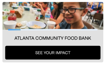
public struct BKImpactOverviewConfiguration {
	var logoHeaderConfig: BKLogoHeaderConfiguration  // For the logo at the top
	var widgetTitle: BKTextConfiguration  // "You just made an impact"
	var widgetSubtitle: BKTextConfiguration  // "Check out the impact.."

	/// The height of the nonprofit image displayed on the card
	///
	/// Defaults to 225.  The width is the size of the view minus outside padding
	var cardImageHeight: CGFloat

	var cardTitle: BKTextConfiguration  // "Your Impact"
	var cardDescription: BKTextConfiguration  // "Fund <n> meals for .."

	var cardBorderConfig: BKBorderConfiguration
	var cardBackgroundColor: Color

	/// The tappable text residing after each card
	var linkText: BKTextConfiguration

	/// The vertical padding between each of the major elements
	var verticalPadding: CGFloat

	/// BG Color for the entire view
	var backgroundColor: Color
Delegates
Again since there are two possible view states you can pass in two different delegates into the init, BKNonprofitSelectionViewDelegate & BKImpactOverviewDelegate. See the section above for description of the BKNonprofitSelectionViewDelegate.
public protocol BKImpactOverviewDelegate: AnyObject {
	/// Delegate method which is called after the user taps the link to
  /// visit a nonprofit's website
	///
	/// - Parameters:
	///     - website: The nonproift's website url in the form of a String
	func onWebsiteLinkTap(website: String)

	/// Method which is called when user taps to see the communities impact
	func onSeeAllCommunityImpactTap()

	/// Called when the view is loading
	func onLoading()

	/// Method which is called when loading is complete
	///
	/// - Parameters:
	///     - success: Returns true if loaded successfully, false if not
	func onLoaded(_ success: Bool)
}