Android SDK
Requirements
- Android 5.0 (API level 21) or above
- Beam API key and chain ID
How to Integrate
Download the Android SDK
In your settings.gradle file, add Jitpack as a resolution for dependencies.
// In settings.gradle
dependencyResolutionManagement {
    repositoriesMode.set(RepositoriesMode.FAIL_ON_PROJECT_REPOS)
    repositories {
        google()
        mavenCentral()
        maven { url 'https://jitpack.io' } // Add this
    }
}
In your app level build.gradle file, add the Beam SDK as a dependency where {version} is the latest version of the SDK.
dependencies {
		implementation 'com.github.Beam-Impact:beam-android-sdk:{version}'
}
Setup
Initialization
Before the SDK can be used, it needs to be initialized with your API key and chain ID that were provided to you.
The best location to initialize the SDK is in your Application#onCreate function, but it can also be done in any Activity#onCreate as long as it is before anything in the SDK is used.
Initialization of the SDK is done through the BeamManager.Builder class. Once the initialization is complete, all usage of the SDK is provided via the Beam interface.
class App : Application() {
    override fun onCreate() {
        super.onCreate()
        initializeBeamSdk()
    }

    private fun initializeBeamSdk() {
        BeamManager
            .Builder(
                applicationContext = applicationContext,
                apiKey = BuildConfig.API_KEY,
                chainId = BuildConfig.CHAIN_ID.toInt()
            )
            .build()
    }
}
Full Initialization Example
The BeamManager contains several other options. See the example below for more details.
class App : Application() {
    override fun onCreate() {
        super.onCreate()
        initializeBeamSdk()
    }

    private fun initializeBeamSdk() {
        BeamManager
            .Builder(
                applicationContext = applicationContext,
                apiKey = BuildConfig.API_KEY,
                chainId = BuildConfig.CHAIN_ID.toInt()
            )
            .environment(environment = BeamManager.BeamEnvironmentUrls.PRODUCTION)
            .fonts(
                ...
            )
            .logLevel(logLevel = Log.VERBOSE)
						.progressBarProperties(
                ...
            )
            .schemaVersion(schemaVersion = "1.0")
            .build()
    }
}
Customization
Fonts
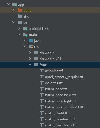
The Beam SDK provides the ability to add a custom font for three different font weights used throughout the SDK: regular, semi-bold, and bold.
-
Ensure your fonts are added as a resource in your app
-
Create an instance of the
BeamManager.Fontsclass and initialize theBeamManagerwith it.class App : Application() {
override fun onCreate() {
super.onCreate()
initializeBeamSdk()
}
private fun initializeBeamSdk() {
val fonts = BeamManager.Fonts(
bold = R.font.kulim_park_bold,
normal = R.font.kulim_park,
semiBold = R.font.kulim_park_semibold
)
BeamManager
.Builder(
applicationContext = applicationContext,
apiKey = BuildConfig.API_KEY,
chainId = BuildConfig.CHAIN_ID.toInt()
)
.fonts(fonts = fonts)
.build()
}
}
Progress Bar
The Beam SDK provides the ability to customize the progress bars on initialization.
-
Add any custom colors to your
colors.xmlresource. 1.<resources>
<color name="purple_200">#FFBB86FC</color>
<color name="purple_500">#FF6200EE</color>
<color name="purple_700">#FF3700B3</color>
<color name="teal_200">#FF03DAC5</color>
<color name="teal_700">#FF018786</color>
<color name="black">#FF000000</color>
<color name="white">#FFFFFFFF</color>
</resources> -
Create an instance of the
ProgressBarPropertiesclass and initialize theBeamManagerwith it.class App : Application() {
override fun onCreate() {
super.onCreate()
initializeBeamSdk()
}
private fun initializeBeamSdk() {
val progressBarProperties = ProgressBarProperties(
backgroundColor = ContextCompat.getColor(this, R.color.white),
gradientColors = listOf(
ContextCompat.getColor(this, R.color.teal_200),
ContextCompat.getColor(this, R.color.purple_200),
ContextCompat.getColor(this, R.color.purple_700)
),
height = 12,
radius = 0,
borderProperties = BorderProperties(
width = 1,
color = ContextCompat.getColor(this, R.color.black),
cornerRadius = 0
)
)
BeamManager
.Builder(
applicationContext = applicationContext,
apiKey = BuildConfig.API_KEY,
chainId = BuildConfig.CHAIN_ID.toInt()
)
.progressBarProperties(progressBarProperties = progressBarProperties)
.build()
}
}
Borders
Border customization is done by using a BorderProperties class.
/**
 * Styling configuration for borders.
 *
 * @property width The width of the border line. Set to 1dp by default.
 * @property color The color of the border. Set to black by default.
 * @property cornerRadius The corner radius of the border. Set to 4dp by default.
 */
data class BorderProperties(
    val width: Int = 1,
    @ColorInt val color: Int = Constants.Colors.BLACK.toInt(),
    val cornerRadius: Int = 4
)
Buttons
Button customization is done by using a ButtonProperties class.
/**
 * Styling configuration for buttons.
 *
 * @property minimumSizeProperties The [SizeProperties] that determine the minimum size of the
 * buttons. Set to 64dp width and 36dp height by default
 * @property elevationProperties The [ElevationProperties] of the button.
 * @property radius The corner radius of the button. Set to 4dp by default.
 * @property borderProperties The [BorderProperties] of the button. Set to `null` by default to
 * remove the border.
 * @property colorProperties The [ColorProperties] of the button.
 * @property padding The [ContentPadding] of the button. Set to 16dp horizontal and 8dp vertical by
 * default.
 * @property textStyle The [BeamTextStyle] of the button. Set to [BeamTextStyle.button] by default.
 */
data class ButtonProperties(
    val minimumSizeProperties: SizeProperties = SizeProperties(
        width = 64,
        height = 36
    ),
    val elevationProperties: ElevationProperties? = ElevationProperties(),
    val radius: Int = 4,
    val borderProperties: BorderProperties? = null,
    val colorProperties: ColorProperties = ColorProperties(),
    val padding: ContentPadding = ContentPadding(
        horizontal = 16,
        vertical = 8
    ),
    val textStyle: BeamTextStyle = BeamTextStyle.button
)
The ButtonProperties class has a few predefined styles using Android Material 2 buttons as a baseline.
These can be accessed and manipulated as shown below.
val myButtonProps = ButtonProperties.outlineButton.copy(borderProperies = /*...*/)
Cards
Card customization can be done using the CardProperties class.
/**
 * Styling configuration for cards
 *
 * @property backgroundColor The background color of the card. Set to white by default.
 * @property elevation The elevation of the card. Set to 4dp by default.
 * @property cornerRadius The corner radius of the card. Set to 4dp by default.
 */
data class CardProperties(
    @ColorInt val backgroundColor: Int = Constants.Colors.WHITE.toInt(),
    val elevation: Int = 4,
    val cornerRadius: Int = 4
)
Dividers
Divider customization can be done using the DividerProperties class.
/**
 * Styling configuration for dividers.
 *
 * @property thickness The thickness of the divider. Set to 1dp by default.
 * @property color The color of the divider. Set to light grey by default.
 * @property padding The [ContentPadding] around the divider.
 */
data class DividerProperties(
    val thickness: Int = 1,
    @ColorInt val color: Int = Constants.Colors.LIGHT_GREY.toInt(),
    val padding: ContentPadding = ContentPadding()
)
Images
Image customization can be done using the ImageProperties class.
/**
 * Styling configuration for images
 *
 * @property size The size of the image. Set to 60dp by default.
 * @property cornerPercent The rounded corner percentage of the image. Set to 25dp by default
 */
data class ImageProperties(
    val size: Int = 60,
    val cornerPercent: Int = 25
)
Radio Buttons
Radio button customization can be done using the RadioButtonProperties class.
/**
 * Styling configuration for radio buttons.
 *
 * @property size The size of the radio button. Set to 8dp by default.
 * @property selectedColor The color of the radio button when it is selected. Set to black by
 * default.
 * @property unselectedColor The color of the radio button when it is not selected. Set to black by
 * default.
 */
data class RadioButtonProperties(
    val size: Int = 8,
    val selectedColor: Int = Constants.Colors.BLACK.toInt(),
    val unselectedColor: Int = Constants.Colors.BLACK.toInt()
)
Text
You can customize each piece of text within the widgets by using the BeamTextStyle data class.
/**
 * Styling configuration for a text view.
 *
 * Includes multiple predefined text styles based on the Material typography.
 *
 * @property color The color integer of the text. Set to black by default.
 * @property fontWeight The [BeamFontWeight] of the font. Set to [BeamFontWeight.NORMAL] by default.
 * @property fontStyle The [BeamFontStyle] of the font. Set to [BeamFontStyle.NORMAL] by default.
 * @property fontSize The size of the font. Set to 12sp by default.
 * @property letterSpacing The spacing between the letters for the text. Set to 0sp by default.
 * @property lineHeight The line height for the text. Unspecified by default.
 * @property textAlign The alignment of the text. Set to null by default.
 */
data class BeamTextStyle(
    @ColorInt val color: Int = Constants.Colors.UNSPECIFIED,
    val fontWeight: BeamFontWeight = BeamFontWeight.NORMAL,
    val fontStyle: BeamFontStyle = BeamFontStyle.NORMAL,
    val fontSize: Int = 12,
    val letterSpacing: Float = 0f,
    val lineHeight: Float = Constants.Text.UNSPECIFIED,
    val textAlign: BeamTextAlign? = null
)
The BeamTextStyle class has several predefined text styles using Android Material 2 typography as a baseline.
These can be accessed and manipulated as shown below.
val myTextStyle = BeamTextStyle.subtitle1.copy(fontWeight = BeamFontWeight.BOLD)
Interface
Using the Beam API
val beam = Beam.getInstance(context)
Cancelling an Ongoing Network Request
Sometimes, it might be necessary to cancel a network request before it finishes. A BeamManager.BeamSubscription is returned from methods that allow this so that they can be canceled when requested.
/**
 * Cancels an ongoing network request by the provided subscription
 *
 * @param subscription The [BeamManager.BeamSubscription] subscription to cancel
 */
fun cancelNetworkRequest(
    subscription: BeamManager.BeamSubscription?
)
class MyFragment: Fragment() {
    private lateinit var beam: Beam
    private var registerUserSubscription: BeamManager.BeamSubscription? = null

    override fun onCreate(savedInstanceState: Bundle?) {
        super.onCreate(savedInstanceState)
        beam = Beam.getInstance(requireContext())
    }

    override fun onCreateView(
        inflater: LayoutInflater,
        container: ViewGroup?,
        savedInstanceState: Bundle?
    ): View {
				// view code omitted

        registerUserSubscription = beam.registerUser(
            email = userEmail,
            onSuccess = {},
            onError = {}
        )
		}

		override fun onDestroyView() {
        beam.cancelNetworkRequest(subscription = registerUserSubscription)
				// OR
				beam.cancelNetworkRequest(subscription = BeamManager.BeamSubscription.REGISTER_USER)
        super.onDestroyView()
    }
}
Registering a User
In order for any transactions to be valid, an email must be provided. The easiest way to do this is to register a user through the Beam SDK when possible. The user is then stored in memory until the app closes or the user is deregistered.
/**
 * Registers a user by email
 *
 * @param email The email of the user
 * @param onSuccess The callback for when the registration is successful. Set to null by
 * default.
 * @param onError The callback for when the registration is not successful. Set to null by
 * default.
 * @return The [BeamManager.BeamSubscription.REGISTER_USER] subscription identifier
 */
fun registerUser(
    email: String,
    onSuccess: (() -> Unit)? = null,
    onError: ((Throwable?) -> Unit)? = null
): BeamManager.BeamSubscription
val beam = Beam.getInstance(this.applicationContext)

val subscription = beam.registerUser(
    email = userEmail,
    onSuccess = {
        // handle success if necessary
    },
    onError = {
        // handle failure if necessary
    }
)
Deregistering a User
This will clear the current active user so that all of the impact views are blank. It is essentially a “logout” function.
/**
 * Deregisters the active user. Note that this also removes any started transactions and
 * selected nonprofits.
 */
fun deregisterUser()
val beam = Beam.getInstance(this.applicationContext)
beam.deregisterUser()
Getting Selected Nonprofit
At any point after a user has selected a nonprofit, you can get the name and cause of the selected nonprofit if you choose to display it somewhere.
/**
 * Nonprofit model
 *
 * @property name The name of the nonprofit
 * @property cause The cause of the nonprofit
 */
data class Nonprofit(
    val name: String?,
    val cause: String?
)

/**
 * Gets the currently selected nonprofit.
 *
 * @return The [Nonprofit] that is selected or null if none have been selected.
 */
fun getSelectedNonprofit(): Nonprofit?
val beam = Beam.getInstance(this.applicationContext)
val nonprofit = beam.getSelectedNonprofit()

println("The selected nonprofit is ${nonprofit?.name}")
Transactions
The transaction methods are how donations are sent to nonprofits through Beam. All transactions must have information corresponding to the Transaction model.
/**
 * Transaction model
 *
 * @property cartTotal The cart total
 * @property currencyCode The currency code
 * @property storeId The store ID
 * @property email The email of the user. Set to null by default.
 * @property postalCode The postal code
 * @property countryCode The country code
 */
data class Transaction(
    val cartTotal: Double,
    val currencyCode: String,
    val storeId: Int,
    val email: String? = null,
    val postalCode: String? = null,
    val countryCode: String? = null
)
Starting a Transaction
Before a transaction is created, it must be started with the base transaction info. This allows you to have a transaction ready to go in your workflow to be finished at the end. This transaction will be stored until either finishTransaction is called, another startTransaction is called, or deregisterUser is called.
/**
 * Starts a transaction. The transaction is not created until [finishTransaction] is called.
 *
 * @param transaction The [Transaction] information
 * @param onSuccess The callback for when starting the transaction is successful. Set to null by
 * default.
 * @param onError The callback for when starting the transaction is not successful. Set to null
 * by default.
 */
fun startTransaction(
    transaction: Transaction,
    onSuccess: (() -> Unit)? = null,
    onError: ((Throwable?) -> Unit)? = null
)
val beam = Beam.getInstance(this.applicationContext)

beam.startTransaction(
    Transaction(
        cartTotal = 20.00,
        currencyCode = "USD",
        storeId = 182,
        email = userEmail
    ),
    onSuccess = {
        makeToast("Successfully started transaction")
    },
    onError = {
        makeToast("Failed to start transaction")
    }
)
Finishing a Transaction
Once a transaction is started, it must be finished with your unique order ID in order to be sent to Beam.
/**
 * Finishes the active transaction.
 *
 * @param orderId The order ID identifying the transaction
 * @param email The email of the user. Set to null by default.
 * @param onSuccess The callback for when finishing the transaction is successful. Set to null
 * by default.
 * @param onError The callback for when finishing the transaction is not successful. Set to null
 * by default.
 * @return Returns either a [BeamManager.BeamSubscription.FINISH_TRANSACTION] subscription
 * identifier for a valid transaction finishing or [BeamManager.BeamSubscription.NO_OP]
 * subscription identifier for an invalid transaction.
 */
fun finishTransaction(
    orderId: String,
    email: String? = null,
    onSuccess: ((transactionId: Int?) -> Unit)? = null,
    onError: ((Throwable?) -> Unit)? = null
): BeamManager.BeamSubscription
val beam = Beam.getInstance(this.applicationContext)

val finishTransactionSubscription = beam.finishTransaction(
    orderId = yourOrderId,
    onSuccess = {
				// handle success
    },
    onError = {
				// handle failure
    }
)
Canceling a Transaction
Transaction can be cancelled after they are created by passing in the unique identifier you provided during finishTransaction.
/**
 * Cancels a transaction that has already been created
 *
 * @param orderId The order ID identifying the transaction
 * @param onSuccess The callback for when cancelling the transaction is successful. Set to null
 * by default.
 * @param onError The callback for when cancelling the transaction is not successful. Set to
 * null by default.
 * @return The [BeamManager.BeamSubscription.CANCEL_TRANSACTION] subscription identifier
 */
fun cancelTransaction(
    orderId: String,
    onSuccess: (() -> Unit)? = null,
    onError: ((Throwable?) -> Unit)? = null
): BeamManager.BeamSubscription
val beam = Beam.getInstance(this.applicationContext)

val cancelTransactionSubscription = beam.cancelTransaction(
    orderId = yourOrderId,
    onSuccess = {
				// handle success
    },
    onError = {
				// handle failure
    }
)
Redeeming a Transaction
A transaction can also be updated with the selected nonprofit. This is useful if a user never selected a nonprofit before the transaction was created.
/**
 * Updates an existing transaction with the stored nonprofit ID
 *
 * @param orderId The order ID identifying the transaction
 * @param transaction The [Transaction] information
 * @param onSuccess The callback for when redeeming the transaction is successful. Set to null
 * by default.
 * @param onError The callback for when redeeming the transaction is not successful. Set to null
 * by default.
 * @return The [BeamManager.BeamSubscription.REDEEM_TRANSACTION] subscription identifier
 */
fun redeemTransaction(
    orderId: String,
    transaction: Transaction,
    onSuccess: (() -> Unit)? = null,
    onError: ((Throwable?) -> Unit)? = null
): BeamManager.BeamSubscription
val beam = Beam.getInstance(this.applicationContext)

val redeemTransactionSubscription = beam.redeemTransaction(
    orderId = yourOrderId,
    transaction = Transaction(
        cartTotal = 20.00,
        currencyCode = "USD",
        storeId = 182
    ),
    onSuccess = {
				// handle success
    },
    onError = {
				// handle failure
    }
)
Error States
At some point during the creation of a transaction, an email must be provided. This can be done via registerUser, startTransaction, or finishTransaction. Note that an error will occur for the following scenarios:
- A transaction was started with a different email than the one belonging to the registered user.
- A transaction was finished without being started.
- A transaction was finished without a registered user and without providing an email when starting or finishing the transaction.
- A transaction was started with a different email than the one used to finish it.
- A transaction was finished with a different email than the one belonging to the registered user.
Widgets
BeamCommunityImpactView
This widget shows the overall community impact for the users last impacted nonprofit with a button allowing the user to see all of their impact. If there is no impact or a saved selected nonprofit for that user, this view will be empty.

-
Toggle for details on Usage, Customization, and Listener
Usage
Jetpack Compose
/**
 * Beam community impact composable view
 *
 * @param modifier The optional [Modifier] to use for the compose layout
 * @param properties The [Properties] for the community impact view. Set to default [Properties] by
 * default.
 * @param listener The optional [Listener] for the community impact view. Set to null by default.
 */
@Composable
fun BeamCommunityImpactCompose(
    modifier: Modifier = Modifier,
    properties: Properties = Properties(),
    listener: Listener? = null
)
Android Views
<com.beamimpact.beamandroidsdk.views.BeamCommunityImpactWidget
    android:id="@+id/beam_community_impact_widget"
    android:layout_width="match_parent"
    android:layout_height="wrap_content" />
val view: BeamCommunityImpactView = findViewById(R.id.beam_community_impact_widget)
view.configureView(/*...*/)
view.setListener(/*...*/)Customization
You can customize almost all aspects of the view using the
BeamCommunityImpactView.Propertiesclass./**
* Styling properties for the community impact view.
*
* @property backgroundColor The background color of the widget. Set to light grey by default.
* @property cornerRadius The corner radius of the background. Set to 4dp by default.
* @property imageHeight The height of the image. Set to 140dp by default.
* @property progressBarHorizontalPadding The padding on either side of the progress bar. Set to
* 16dp by default.
* @property contentPadding The [ContentPadding] around the nonprofit name and impact button.
* Set all to 24dp by default.
* @property verticalSpacing The amount of spacing between each element in the widget. Set to
* 16dp by default.
* @property nonprofitTextStyle The [BeamTextStyle] for the nonprofit name. Set to
* [BeamTextStyle.h6] by default.
* @property buttonProperties The [ButtonProperties] for the impact button. Set to
* [ButtonProperties.button] by default.
*/
data class Properties(
@ColorInt val backgroundColor: Int = Constants.Colors.CHARCOAL_50.toInt(),
val cornerRadius: Int = 4,
val imageHeight: Int = 140,
val progressBarHorizontalPadding: Int = 16,
val contentPadding: ContentPadding = ContentPadding(all = 24),
val verticalSpacing: Int = 16,
val nonprofitTextStyle: BeamTextStyle = BeamTextStyle.h6,
val buttonProperties: ButtonProperties = ButtonProperties.button()
)Listener
The listener can be used to listen to events and react appropriately.
/**
 * Interface for listening to events on the community impact view
 */
interface Listener {
    /**
     * Callback that is triggered when the button is clicked.
     */
    fun onButtonClick()
}
BeamFullScreenNonprofitSelectionView
This is an option for allowing a user to select a nonprofit but is meant to take up the whole screen. The isPrePurchase boolean set on the is used to determine if the view is used anytime during the pre-purchase flow or not.

List style before a nonprofit is selected

Grid style before a nonprofit is selected

List style after a nonprofit is selected

Grid style after a nonprofit is selected
-
Toggle for details on Usage, Customization, and Listener
Usage
Jetpack Compose
/**
 * Beam full screen nonprofit selection composable view
 *
 * @param modifier The optional [Modifier] to use for the compose layout
 * @param properties The [Properties] for the full screen nonprofit selection view. Set to default
 * [Properties] by default.
 * @param listener The optional [Listener] for the full screen nonprofit selection view. Set to null
 * by default.
 * @param isPrePurchase Controls whether or not the view is being used for pre-purchase or
 * post-purchase. Set to true by default.
 */
@Composable
fun BeamFullScreenNonprofitSelectionCompose(
    modifier: Modifier = Modifier,
    properties: Properties = Properties(),
    listener: Listener? = null,
    isPrePurchase: Boolean = true
)
Android Views
<com.beamimpact.beamandroidsdk.views.BeamFullScreenNonprofitSelectionWidget
    android:id="@+id/beam_full_screen_nonprofit_selection_widget"
    android:layout_width="match_parent"
    android:layout_height="wrap_content" />
val view: BeamFullScreenNonprofitSelectionView = findViewById(R.id.beam_full_screen_nonprofit_selection_widget)
view.configureView(/*...*/)
view.setListener(/*...*/)
view.isPrePurchase = trueCustomization
You can customize almost all aspects of the view using the
BeamFullScreenNonprofitSelectionView.Propertiesclass./**
* Styling configuration for the full screen nonprofit selection view.
*
* @property style The style of view to show. Set to [Style.LIST] by default.
* @property backgroundColor The background color of the widget. Set to white by default.
* @property headerImageHeight The height of the header image. Set to 220dp by default.
* @property headerImageUrl The URL of the image to use in the header. Set to null by default.
* @property listPadding The amount of padding around the list. Set to 16dp on the top, start,
* and end by default. Set to 72dp on the bottom by default in order to avoid the button drawing
* on top of the list items.
* @property headerVerticalPadding The amount of spacing between each element of the header. Set
* to 4dp by default.
* @property titleTextStyle The [BeamTextStyle] of the title. Set to [BeamTextStyle.h4] by
* default.
* @property subtitleTextStyle The [BeamTextStyle] of the subtitle. Set to
* [BeamTextStyle.subtitle1] by default.
* @property beamTextStyle The [BeamTextStyle] of the "Powered by Beam". Set to
* [BeamTextStyle.caption] and aligned to the end by default.
* @property spacingBetweenListItems The amount of spacing between each nonprofit in the list.
* Set to 8dp by default.
* @property listItemProperties The [ListItemProperties] of each element in the list.
* @property confirmButtonProperties The [ButtonProperties] of the confirm button. Set to
* [ButtonProperties.button] by default.
* @property confirmButtonOuterPadding The [ContentPadding] around the button. Set horizontal to
* 16dp by default.
*/
data class Properties(
val style: Style = Style.LIST,
@ColorInt val backgroundColor: Int = Constants.Colors.WHITE.toInt(),
val headerImageHeight: Int = 220,
val headerImageUrl: String? = null,
val listPadding: ContentPadding = ContentPadding(
start = 16,
end = 16,
top = 16,
bottom = 72
),
val headerVerticalPadding: Int = 4,
val titleTextStyle: BeamTextStyle = BeamTextStyle.h4,
val subtitleTextStyle: BeamTextStyle = BeamTextStyle.subtitle1,
val beamTextStyle: BeamTextStyle = BeamTextStyle.caption.copy(
textAlign = BeamTextAlign.END
),
val spacingBetweenListItems: Int = 8,
val listItemProperties: ListItemProperties = ListItemProperties(),
val confirmButtonProperties: ButtonProperties = ButtonProperties.button(),
val confirmButtonOuterPadding: ContentPadding = ContentPadding(horizontal = 16)
)Listener
The listener can be used to listen to events and react appropriately.
/**
 * Interface for listening to events on the full screen nonprofit selection view
 */
interface Listener {
    /**
     * Callback that is triggered when a nonprofit is confirmed
     *
     * @param nonprofitName The name of the nonprofit
     * @param nonprofitCause The cause the nonprofit supports
     */
    fun onConfirmClick(nonprofitName: String?, nonprofitCause: String?)
}
BeamImpactListView
This widget is a tabbed view which shows both a summary of users personal impact as well as the impact the community has made. It is scrollable vertically and is meant to take up a whole screen. If there is no personal impact made yet, only community is shown.


-
Toggle for details on Usage, Customization, and Listener
Usage
Jetpack Compose
/**
 * Beam impact list composable view
 *
 * @param properties The [Properties] for the impact list view. Set to default [Properties] by
 * default.
 * @param listener The optional [Listener] for the impact list view. Set to null by default.
 */
@Composable
fun BeamImpactListCompose(
    properties: Properties = Properties(),
    listener: Listener? = null
)
Android Views
<com.beamimpact.beamandroidsdk.views.BeamImpactListWidget
    android:id="@+id/beam_impact_list_widget"
    android:layout_width="match_parent"
    android:layout_height="wrap_content" />
val view: BeamImpactListView = findViewById(R.id.beam_impact_list_widget)
view.configureView(/*...*/)
view.setListener(/*...*/)Customization
You can customize almost all aspects of the view using the
[BeamImpactListView.Properties](http://BeamImpactListView.Properties)class./**
* Styling properties for the impact list view.
*
* @property logoHeaderProperties The [LogoHeaderProperties] of the logos at the top. Set
* alignment to center and all padding to 8dp by default.
* @property tabProperties The [TabProperties] for the tabs
* @property spacingBetweenListItems The amount of spacing between each nonprofit in the list.
* Set to 8dp by default.
* @property listPadding The amount of padding around the list. Set all to 8dp by default.
* @property listItemProperties The [ListItemProperties] for each element in the list.
*/
data class Properties(
val logoHeaderProperties: LogoHeaderProperties = LogoHeaderProperties(
padding = ContentPadding(all = 8),
horizontalAlignment = BeamHorizontalAlignment.CENTER
),
val tabProperties: TabProperties = TabProperties(),
val spacingBetweenListItems: Int = 8,
val listPadding: ContentPadding = ContentPadding(all = 8),
val listItemProperties: ListItemProperties = ListItemProperties()
)Listener
The listener can be used to listen to events and react appropriately.
/**
 * Interface for listening to events on the impact list view
 */
interface Listener {
    /**
     * Callback that is triggered when the website link button is clicked.
     *
     * @param website The link to the website
     */
    fun onWebsiteLinkClick(website: String?)
}
BeamMinimalNonprofitSelectionView

Before a nonprofit is selected

After a nonprofit is selected
-
Toggle for details on Usage, Customization, and Listener
Usage
Jetpack Compose
/**
 * Beam minimal nonprofit selection composable view
 *
 * @param modifier The optional [Modifier] to use for the compose layout
 * @param properties The [Properties] for the minimal nonprofit selection view. Set to default
 * [Properties] by default.
 * @param listener The optional [Listener] for the minimal nonprofit selection view. Set to null by
 * default.
 * @param isPrePurchase Controls whether or not the view is being used for pre-purchase or
 * post-purchase. Set to true by default.
 */
@Composable
fun BeamMinimalNonprofitSelectionCompose(
    modifier: Modifier = Modifier,
    properties: Properties = Properties(),
    listener: Listener? = null,
    isPrePurchase: Boolean = true
)
Android Views
<com.beamimpact.beamandroidsdk.views.BeamMinimalNonprofitSelectionWidget
    android:id="@+id/beam_minimal_nonprofit_selection_widget"
    android:layout_width="match_parent"
    android:layout_height="wrap_content" />
val view: BeamMinimalNonprofitSelectionView = findViewById(R.id.beam_minimal_nonprofit_selection_widget)
view.configureView(/*...*/)
view.setListener(/*...*/)
view.isPrePurchase = trueCustomization
You can customize almost all aspects of the view using the
BeamMinimalNonprofitSelectionView.Propertiesclass./**
* Styling configuration for the minimal nonprofit selection view
*
* @property titleTextStyle The [BeamTextStyle] of the title. Set to [BeamTextStyle.h4] by
* default
* @property subtitleTextStyle The [BeamTextStyle] of the description. Set to
* [BeamTextStyle.subtitle1] by default
* @property optionProperties The [OptionProperties] for the nonprofit options
* @property detailBorderProperties The [BorderProperties] of the selected nonprofit details
* @property detailPadding The [ContentPadding] inside the selected nonprofit details
* @property causeTextStyle The [BeamTextStyle] of the nonprofit cause. Set to
* [BeamTextStyle.subtitle2] by default
* @property impactGoalTextStyle The [BeamTextStyle] of the nonprofit's impact description.
* Set to [BeamTextStyle.body1] by default.
* @property beamAttributionBeamTextStyle The [BeamTextStyle] of the "Powered by Beam" text. Set to
* [BeamTextStyle.caption] by default.
* @property progressBarLabelTextStyle The [BeamTextStyle] of the progress bar text. Set to
* [BeamTextStyle.caption] by default.
* @property buttonProperties The [ButtonProperties] of the confirmation button. Set to the
* [ButtonProperties.button] by default.
*/
data class Properties(
val titleTextStyle: BeamTextStyle = BeamTextStyle.h4,
val subtitleTextStyle: BeamTextStyle = BeamTextStyle.subtitle1,
val optionProperties: OptionProperties = OptionProperties(),
val detailBorderProperties: BorderProperties = BorderProperties(),
val detailPadding: ContentPadding = ContentPadding(all = 16),
val causeTextStyle: BeamTextStyle = BeamTextStyle.subtitle2,
val impactGoalTextStyle: BeamTextStyle = BeamTextStyle.body1,
val beamAttributionBeamTextStyle: BeamTextStyle = BeamTextStyle.caption,
val progressBarLabelTextStyle: BeamTextStyle = BeamTextStyle.caption,
val buttonProperties: ButtonProperties = ButtonProperties.button()
)Listener
The listener can be used to listen to events and react appropriately.
/**
 * Interface for listening to events on the minimal nonprofit selection view
 */
interface Listener {
    /**
     * Callback that is triggered when a nonprofit is confirmed
     *
     * @param nonprofitName The name of the nonprofit
     * @param nonprofitCause The cause the nonprofit supports
     */
    fun onConfirmClick(nonprofitName: String?, nonprofitCause: String?)
}
BeamOrderPageView
A simple way to show either the BeamMinimalNonprofitSelectionView or the BeamImpactOverviewView after an order has been placed. If the user never selected a nonprofit during a transaction this gives them the opportunity to do so now. Transactions can only be redeemed within 30 days. If the user did select a nonprofit, this view will show their impact for a given transaction.
Showcases the order page widget after a transaction is created without selecting a nonprofit, to selecting and confirming a nonprofit, to showing the impact once confirmed
-
Toggle for details on Usage, Customization, and Listener
Usage
Jetpack Compose
/**
 * Beam order page composable view
 *
 * @param orderId The order ID associated with the order
 * @param transaction The [Transaction] associated with the order
 * @param impactOverviewProperties The [BeamImpactOverviewView.Properties] for the impact overview
 * view. Set to default [BeamImpactOverviewView.Properties] by default.
 * @param impactOverviewListener The optional [BeamImpactOverviewView.Listener] for the impact
 * overview view. Set to null by default.
 * @param minimalNonprofitSelectionProperties The [BeamMinimalNonprofitSelectionView.Properties] for
 * the minimal nonprofit selection view. Set to default
 * [BeamMinimalNonprofitSelectionView.Properties] by default.
 * @param minimalNonprofitSelectionListener The optional
 * [BeamMinimalNonprofitSelectionView.Listener] for the minimal nonprofit selection view. Set to
 * null by default.
 */
@Composable
fun BeamOrderPageCompose(
    orderId: String,
    transaction: Transaction,
    impactOverviewProperties: BeamImpactOverviewView.Properties =
        BeamImpactOverviewView.Properties(),
    impactOverviewListener: BeamImpactOverviewView.Listener? = null,
    minimalNonprofitSelectionProperties: BeamMinimalNonprofitSelectionView.Properties =
        BeamMinimalNonprofitSelectionView.Properties(),
    minimalNonprofitSelectionListener: BeamMinimalNonprofitSelectionView.Listener? = null
)
Android Views
<com.beamimpact.beamandroidsdk.views.BeamOrderPageWidget
    android:id="@+id/beam_order_page_widget"
    android:layout_width="match_parent"
    android:layout_height="wrap_content" />
val view: BeamOrderPageView = findViewById(R.id.beam_order_page_widget)
view.initializeView(orderId = yourOrderId, transaction = yourTransaction)
view.configureImpactOverviewView(/*...*/)
view.configureMinimalNonprofitSelectionView(/*...*/)
view.setImpactOverviewListener(/*...*/)
view.setMinimalNonprofitSelectionListener(/*...*/)Customization
You can customize almost all aspects of the view using the
BeamImpactOverviewView.Propertiesclass and theBeamMinimalNonprofitSelectionView.Propertiesclass./**
* Styling configuration for the impact overview view.
*
* @property verticalSpacing The amount of spacing between each element in the widget. Set to
* 16dp by default.
* @property logoHeaderProperties The [LogoHeaderProperties] of the logos at the top.
* @property titleTextStyle The [BeamTextStyle] of the title. Set to [BeamTextStyle.h6] by
* default.
* @property subtitleTextStyle The [BeamTextStyle] of the description. Set to
* [BeamTextStyle.subtitle1] by default.
* @property impactCardProperties The [ImpactCardProperties] of the personal and community
* impact cards.
* @property linkText The [BeamTextStyle] of the link text. Set to [BeamTextStyle.body2] by
* default.
*/
data class Properties(
val verticalSpacing: Int = 16,
val logoHeaderProperties: LogoHeaderProperties = LogoHeaderProperties(),
val titleTextStyle: BeamTextStyle = BeamTextStyle.h6,
val subtitleTextStyle: BeamTextStyle = BeamTextStyle.subtitle1,
val impactCardProperties: ImpactCardProperties = ImpactCardProperties(),
val linkText: BeamTextStyle = BeamTextStyle.body2
)/**
* Styling configuration for the minimal nonprofit selection view
*
* @property titleTextStyle The [BeamTextStyle] of the title. Set to [BeamTextStyle.h4] by
* default
* @property subtitleTextStyle The [BeamTextStyle] of the description. Set to
* [BeamTextStyle.subtitle1] by default
* @property optionProperties The [OptionProperties] for the nonprofit options
* @property detailBorderProperties The [BorderProperties] of the selected nonprofit details
* @property detailPadding The [ContentPadding] inside the selected nonprofit details
* @property causeTextStyle The [BeamTextStyle] of the nonprofit cause. Set to
* [BeamTextStyle.subtitle2] by default
* @property impactGoalTextStyle The [BeamTextStyle] of the nonprofit's impact description.
* Set to [BeamTextStyle.body1] by default.
* @property beamAttributionBeamTextStyle The [BeamTextStyle] of the "Powered by Beam" text. Set to
* [BeamTextStyle.caption] by default.
* @property progressBarLabelTextStyle The [BeamTextStyle] of the progress bar text. Set to
* [BeamTextStyle.caption] by default.
* @property buttonProperties The [ButtonProperties] of the confirmation button. Set to the
* [ButtonProperties.button] by default.
*/
data class Properties(
val titleTextStyle: BeamTextStyle = BeamTextStyle.h4,
val subtitleTextStyle: BeamTextStyle = BeamTextStyle.subtitle1,
val optionProperties: OptionProperties = OptionProperties(),
val detailBorderProperties: BorderProperties = BorderProperties(),
val detailPadding: ContentPadding = ContentPadding(all = 16),
val causeTextStyle: BeamTextStyle = BeamTextStyle.subtitle2,
val impactGoalTextStyle: BeamTextStyle = BeamTextStyle.body1,
val beamAttributionBeamTextStyle: BeamTextStyle = BeamTextStyle.caption,
val progressBarLabelTextStyle: BeamTextStyle = BeamTextStyle.caption,
val buttonProperties: ButtonProperties = ButtonProperties.button()
)Listener
The listeners can be used to listen to events and react appropriately. The order page view includes both
BeamImpactOverviewView.ListenerandBeamMinimalNonprofitSelectionView.Listener./**
* Interface for listening to events on the impact overview view
*/
interface Listener {
/**
* Callback that is triggered when the website link is clicked.
*
* @param websiteLink The link to the website
*/
fun onWebsiteLinkClick(websiteLink: String)
/**
* Callback that is triggered when the see all community link is clicked.
*/
fun onSeeAllCommunityImpactClick()
/**
* Callback that is triggered when the impact overview is loading
*/
fun onLoading()
/**
* Callback that is triggered when the impact overview successfully loads
*/
fun onSuccess()
/**
* Callback that is triggered when the impact overview fails to load
*
* @param throwable The [Throwable] associated with the error
*/
fun onError(throwable: Throwable?)
}/**
* Interface for listening to events on the minimal nonprofit selection view
*/
interface Listener {
/**
* Callback that is triggered when a nonprofit is confirmed
*
* @param nonprofitName The name of the nonprofit
* @param nonprofitCause The cause the nonprofit supports
*/
fun onConfirmClick(nonprofitName: String?, nonprofitCause: String?)
}
BeamPersonalImpactView
A simple, compact way to show the user their impact. This will always show the last impacted nonprofit and not the currently selected nonprofit, if those should differ. If there is no impact to be shown, this view will be empty.

-
Toggle for details on Usage, Customization, and Listener
Usage
Jetpack Compose
/**
 * Beam personal impact composable view
 *
 * @param modifier The optional [Modifier] to use for the compose layout
 * @param properties The [Properties] for the personal impact view. Set to default [Properties] by
 * default.
 * @param listener The optional [Listener] for the personal impact view. Set to null by default.
 */
@Composable
fun BeamPersonalImpactCompose(
    modifier: Modifier = Modifier,
    properties: Properties = Properties(),
    listener: Listener? = null
)
Android Views
<com.beamimpact.beamandroidsdk.views.BeamPersonalImpactWidget
    android:id="@+id/beam_personal_impact_widget"
    android:layout_width="match_parent"
    android:layout_height="wrap_content" />
val view: BeamPersonalImpactView = findViewById(R.id.beam_personal_impact_widget)
view.configureView(/*...*/)
view.setListener(/*...*/)Customization
You can customize almost all aspects of the view using the
BeamPersonalImpactView.Propertiesclass./**
* Styling configuration for the personal impact view
*
* @property verticalSpacing The amount of spacing between each element of the widget. Set to
* 4dp by default.
* @property imageProperties The [ImageProperties] of the image
* @property causeTextStyle The [BeamTextStyle] of the cause. Set to [BeamTextStyle.caption]
* by default.
* @property nonprofitNameTextStyle The [BeamTextStyle] of the nonprofit name. Set to
* [BeamTextStyle.body1] by default.
* @property progressBarLabelTextStyle The [BeamTextStyle] of the progress bar label. Set to
* [BeamTextStyle.caption] by default.
* @property impactDescriptionTextStyle The [BeamTextStyle] of the impact description. Set
* to [BeamTextStyle.body1] by default.
* @property goalCompletionTextStyle The [BeamTextStyle] of the times the goal has been
* completed. Set to [BeamTextStyle.caption] by default.
* @property showChangeButton Determines if the change button is shown. Set to false by default
* @property dividerProperties The [DividerProperties] of the divider. It can be set to null to
* remove the divider.
* @property changeButtonProperties The [ButtonProperties] of the change button. Set to
* [ButtonProperties.textButton] by default.
*/
data class Properties(
val verticalSpacing: Int = 4,
val imageProperties: ImageProperties = ImageProperties(),
val causeTextStyle: BeamTextStyle = BeamTextStyle.caption,
val nonprofitNameTextStyle: BeamTextStyle = BeamTextStyle.body1,
val progressBarLabelTextStyle: BeamTextStyle = BeamTextStyle.caption,
val impactDescriptionTextStyle: BeamTextStyle = BeamTextStyle.body1,
val goalCompletionTextStyle: BeamTextStyle = BeamTextStyle.caption,
val showChangeButton: Boolean = false,
val dividerProperties: DividerProperties? = DividerProperties(
padding = ContentPadding(
top = 8
)
),
val changeButtonProperties: ButtonProperties = ButtonProperties.textButton()
)Listener
The listener can be used to listen to events and react appropriately.
/**
 * Interface for listening to events on the personal impact view
 */
interface Listener {
    /**
     * Callback that is triggered when the change button is clicked
     */
    fun onChangeClick()
}
BeamSelectedNonprofitView
A compact way to show the user their currently selected nonprofit. This is a great way to remind the user who their donation is going to in their cart. It includes two styles to choose from with the option to allow the user to change who they have selected.

Default style for selected nonprofit

Out to lunch style for selected nonprofit
-
Toggle for details on Usage, Customization, and Listener
Usage
Jetpack Compose
/**
 * Beam minimal nonprofit selection composable view
 *
 * @param modifier The optional [Modifier] to use for the compose layout
 * @param properties The [Properties] for the minimal nonprofit selection view. Set to default
 * [Properties] by default.
 * @param listener The optional [Listener] for the minimal nonprofit selection view. Set to null by
 * default.
 * @param isPrePurchase Controls whether or not the view is being used for pre-purchase or
 * post-purchase. Set to true by default.
 */
@Composable
fun BeamMinimalNonprofitSelectionCompose(
    modifier: Modifier = Modifier,
    properties: Properties = Properties(),
    listener: Listener? = null,
    isPrePurchase: Boolean = true
)
Android Views
<com.beamimpact.beamandroidsdk.views.BeamSelectedNonprofitWidget
    android:id="@+id/beam_selected_nonprofit_widget"
    android:layout_width="match_parent"
    android:layout_height="wrap_content" />
val view: BeamSelectedNonprofitView = findViewById(R.id.beam_selected_nonprofit_widget)
view.configureView(/*...*/)
view.setListener(/*...*/)Customization
You can customize almost all aspects of the view using the
BeamSelectedNonprofitView.Propertiesclass./**
* Styling configuration for the selected nonprofit view
*
* @property style The style of view to show. Set to [Style.REGULAR] by default.
* @property verticalSpacing The amount of spacing between each element of the widget. Set to
* 4dp by default.
* @property imageProperties The [ImageProperties] of the image. If style is [Style.REGULAR],
* set to the default [ImageProperties] by default. If style is [Style.OUT_TO_LUNCH], set size
* to 90dp and corner percent to 0 by default.
* @property impactTextStyle The [BeamTextStyle] of the impact. Set to [BeamTextStyle.body2] by
* default.
* @property impactGoalTextStyle The [BeamTextStyle] of the impact goal. Set to
* [BeamTextStyle.body1] by default.
* @property progressBarLabelTextStyle The [BeamTextStyle] of the progress bar label. Set to
* [BeamTextStyle.caption] by default.
* @property showChangeButton Determines if the change button is shown. If style is
* [Style.REGULAR], set to false by default. If style is [Style.OUT_TO_LUNCH], set to true by
* default.
* @property dividerProperties The [DividerProperties] of the divider. It can be set to null to
* remove the divider.
* @property changeButtonProperties The [ButtonProperties] of the change button. Set to
* [ButtonProperties.textButton] by default.
*/
data class Properties(
val style: Style = Style.REGULAR,
val verticalSpacing: Int = 4,
val imageProperties: ImageProperties = if (style == Style.REGULAR) {
ImageProperties()
} else {
ImageProperties(size = 90, cornerPercent = 0)
},
val impactTextStyle: BeamTextStyle = BeamTextStyle.body1,
val impactGoalTextStyle: BeamTextStyle = BeamTextStyle.body2,
val progressBarLabelTextStyle: BeamTextStyle = BeamTextStyle.caption,
val showChangeButton: Boolean = style == Style.OUT_TO_LUNCH,
val dividerProperties: DividerProperties? = DividerProperties(),
val changeButtonProperties: ButtonProperties = ButtonProperties.textButton()
)Listener
The listener can be used to listen to events and react appropriately.
/**
 * Interface for listening to events on the selected nonprofit view
 */
interface Listener {
    /**
     * Callback that is triggered when the "Change" button is clicked
     */
    fun onChangeClick()
}